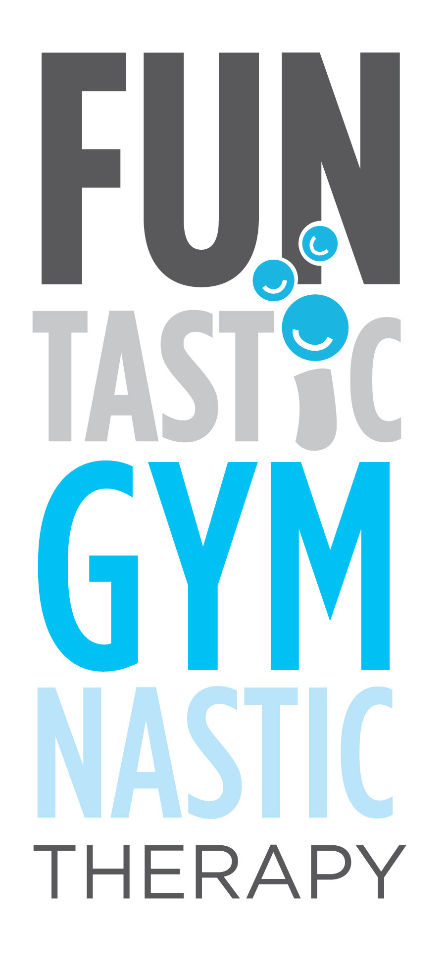
Above: Funtastic Gymnastic logo mark
Logo Strategy: The mark, which is nested inside the company name is a light blue, illustrated lowercase I. The
tittle of this i character is a smiley face bubble. The mark is meant to initially call attention to the idea of a person attending the classes in first person (I) as it helps to spell out fantastic. The dot in this stylized lowercase letter, as mentioned previously, alludes to a smiley face as well as a bubble. This is because both things convey a fun experience. The mark can appear separate from the logotype on various Funtastic applications. In addition to this, the tittle can appear by itself on various publications in the form of a blue outline pattern. This allows for the playful character mark to translate into a more sophisticated application when applied elsewhere. This is also what makes the signature applicable for such a wide demographic of ages.
Below: Funtastic Gymnastic Print Collateral (business card, envelope and letterhead)
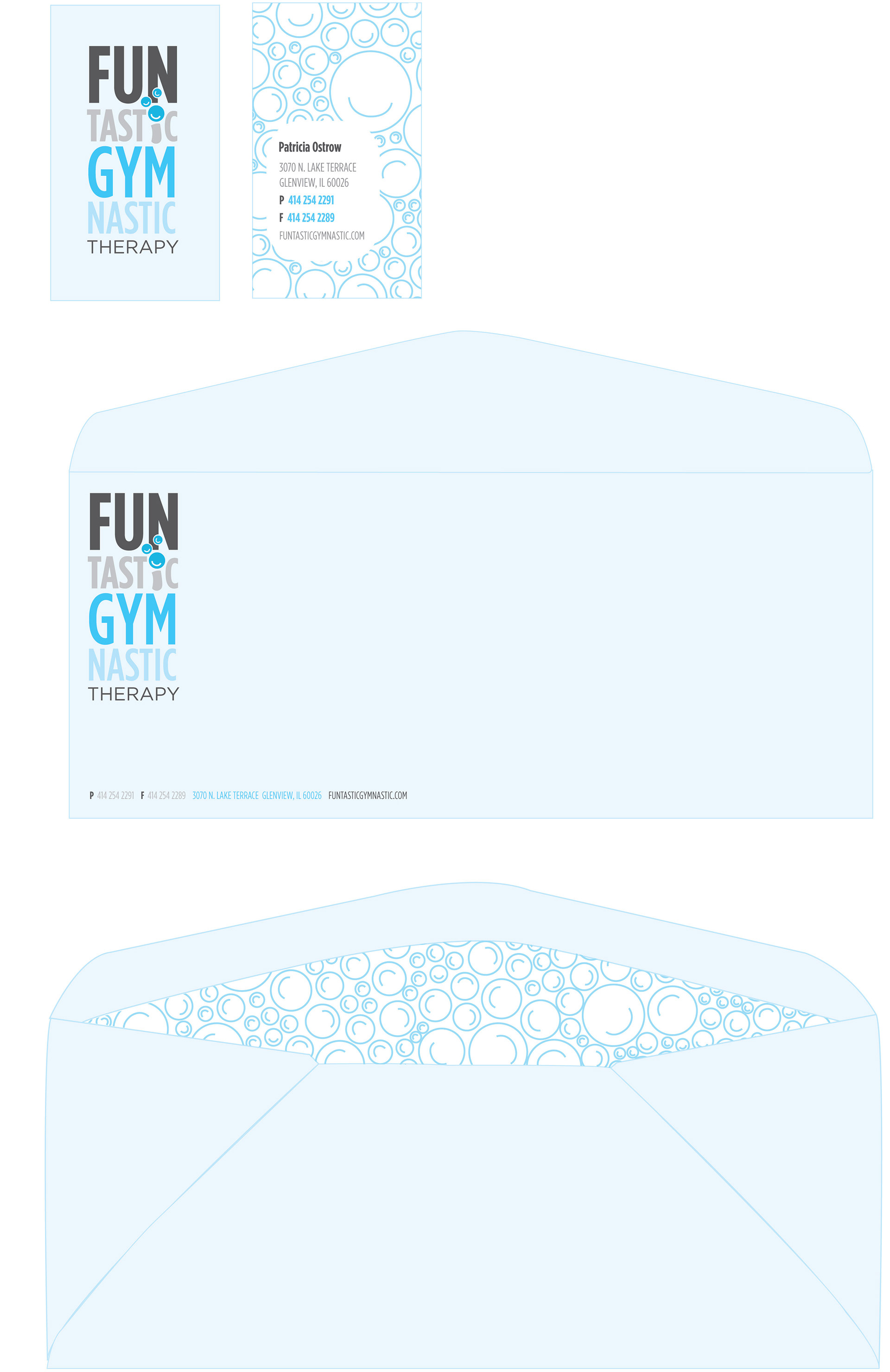
Above: front and back of business card and envelope
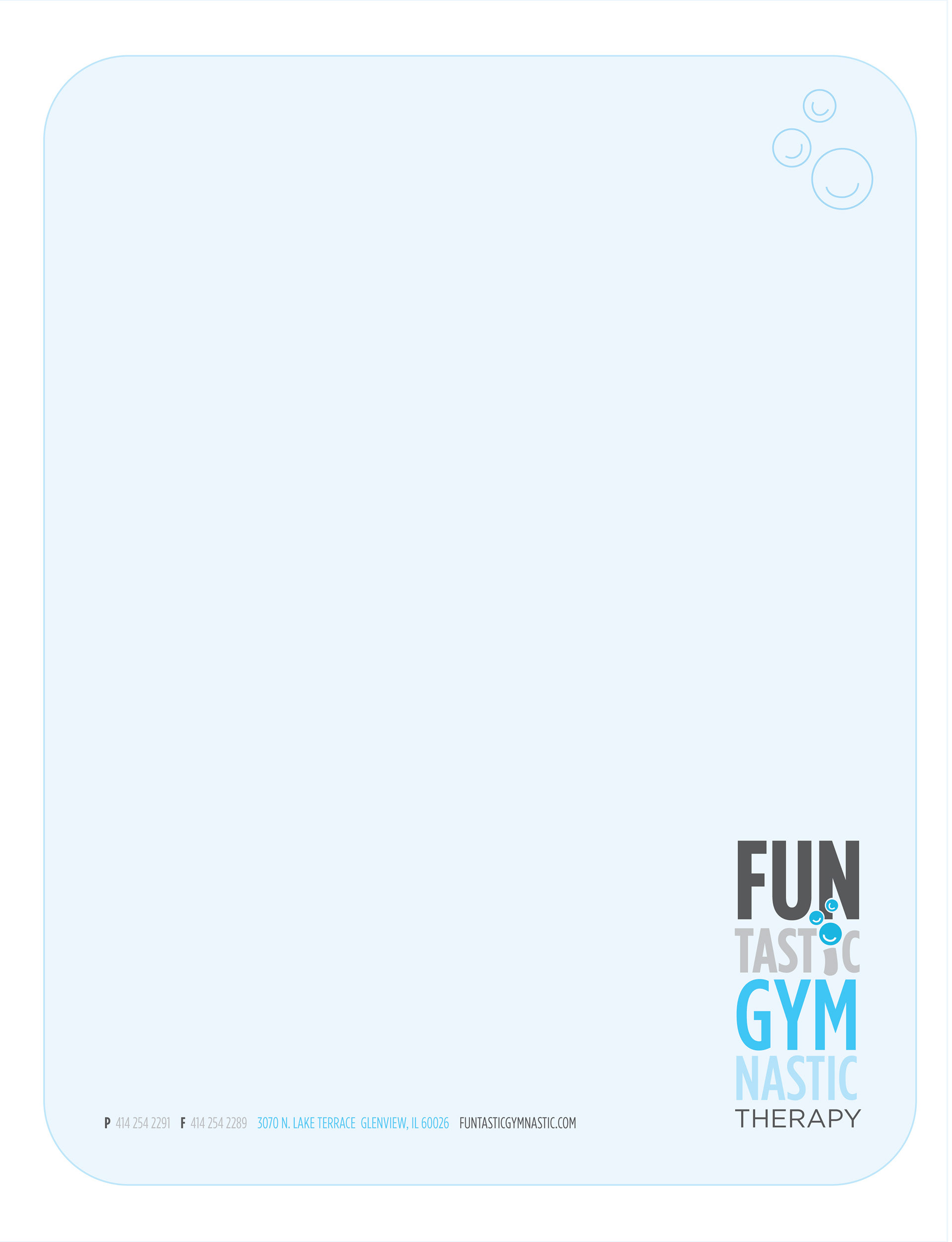
Above: large view of the letterhead for Funtastic Gymnastic Therapy
Below: smaller view of all four ads created for Funtastic Gymnastic Therapy
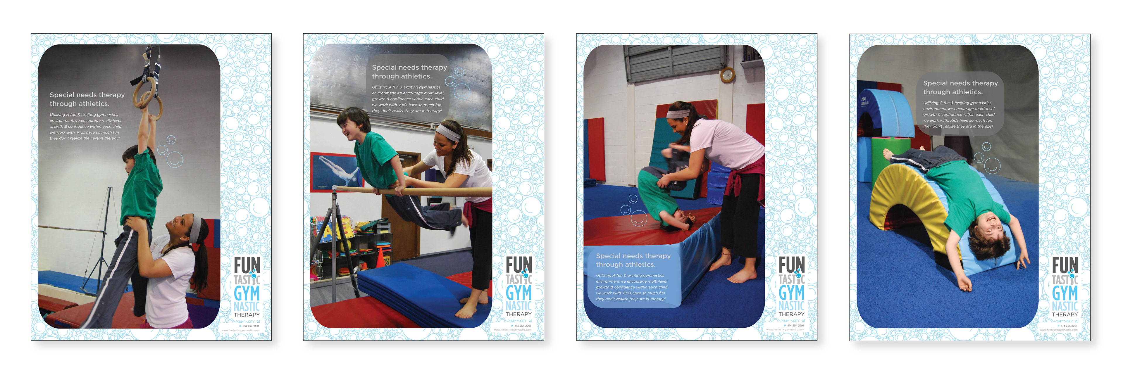
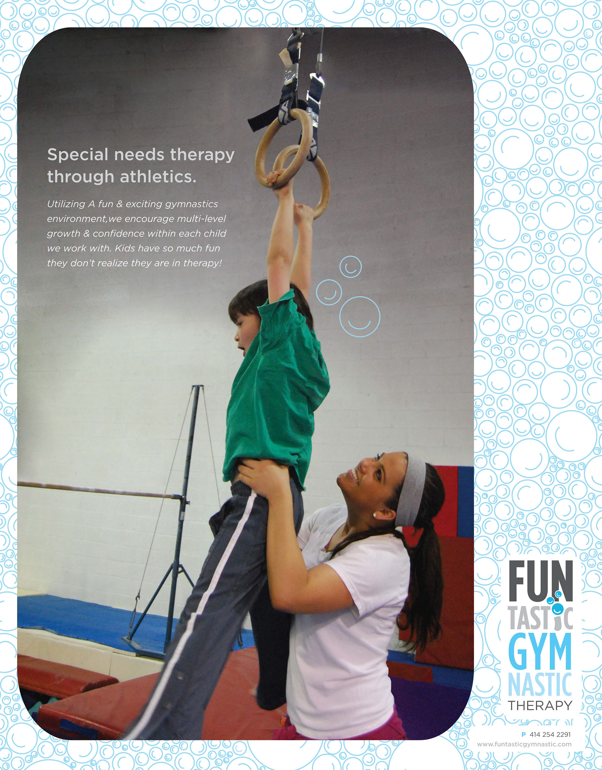
Below: Large view of all four ads
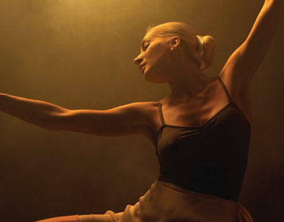
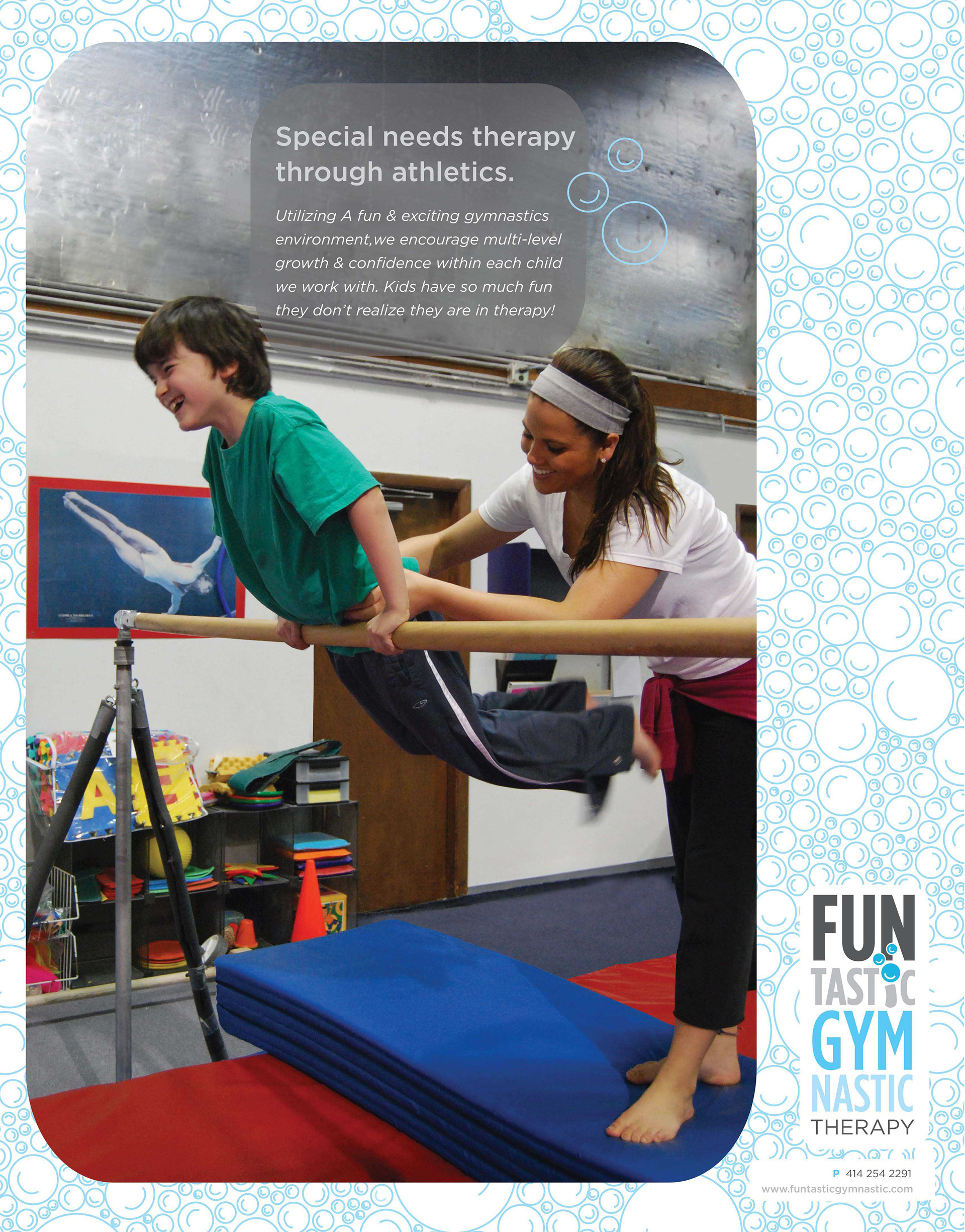
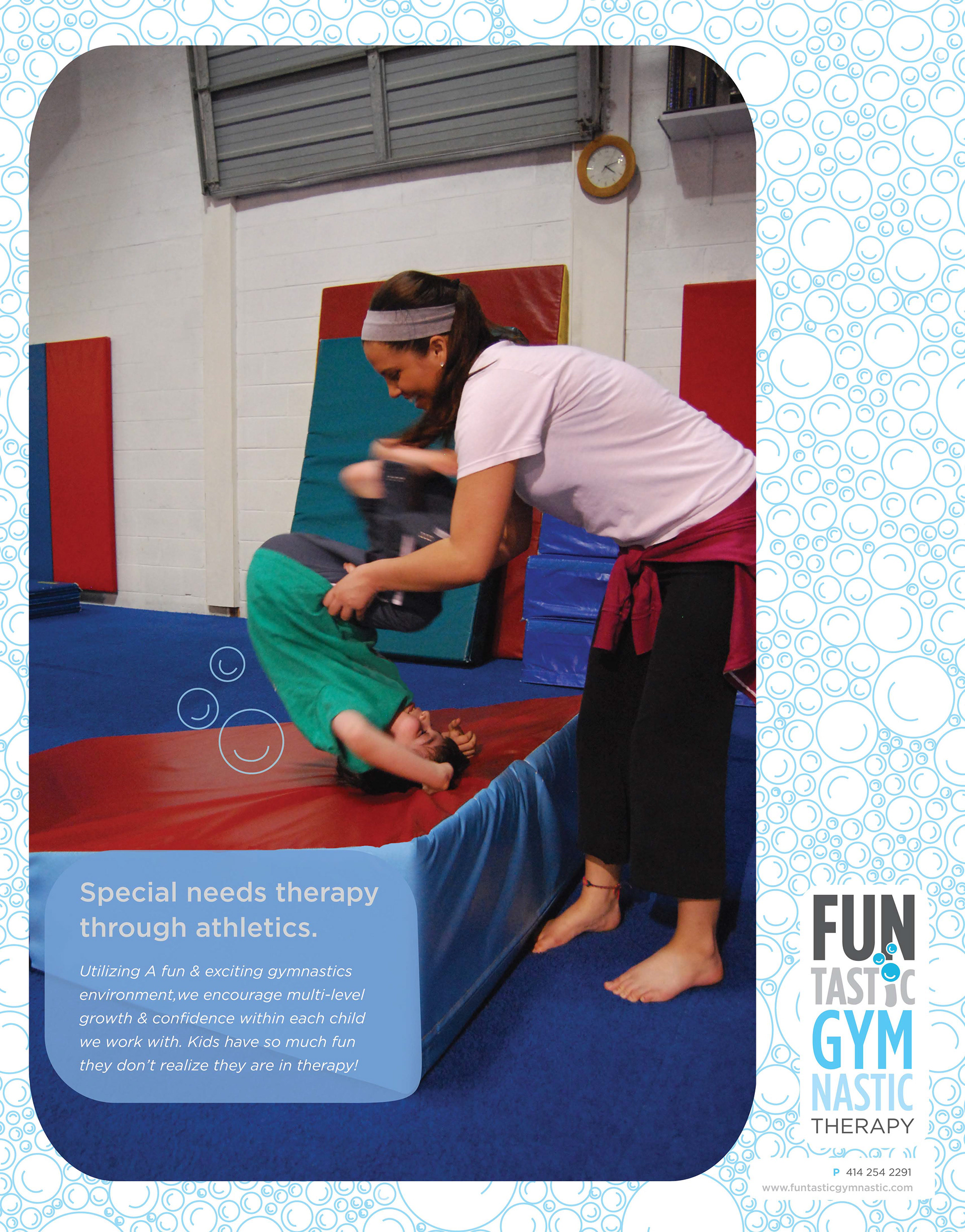
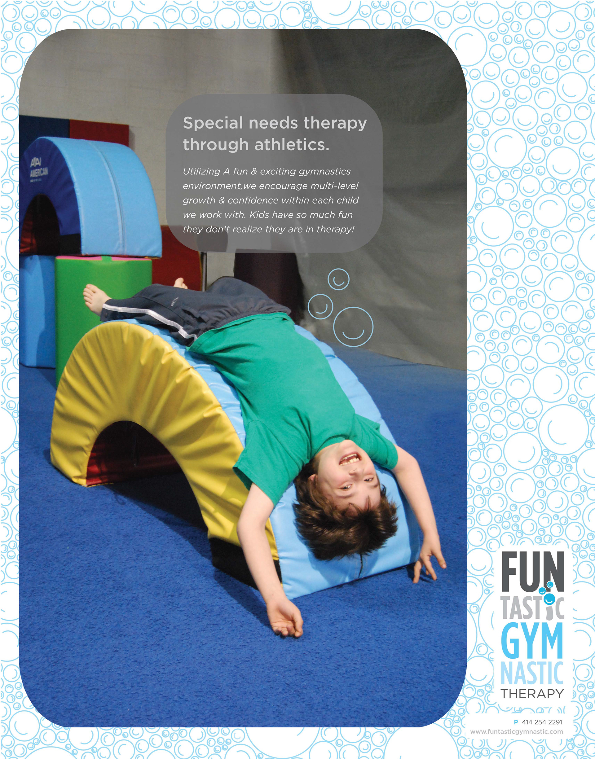
Ad Strategy: The advertisements created for Funtastic Gymnastic Therapy feature photos of a child participating in
the therapeutic gymnastic activities. This allows outsiders to become familiarized with what goes on within sessions, and to become engaged - prompting them to learn more about the company by visiting the website.
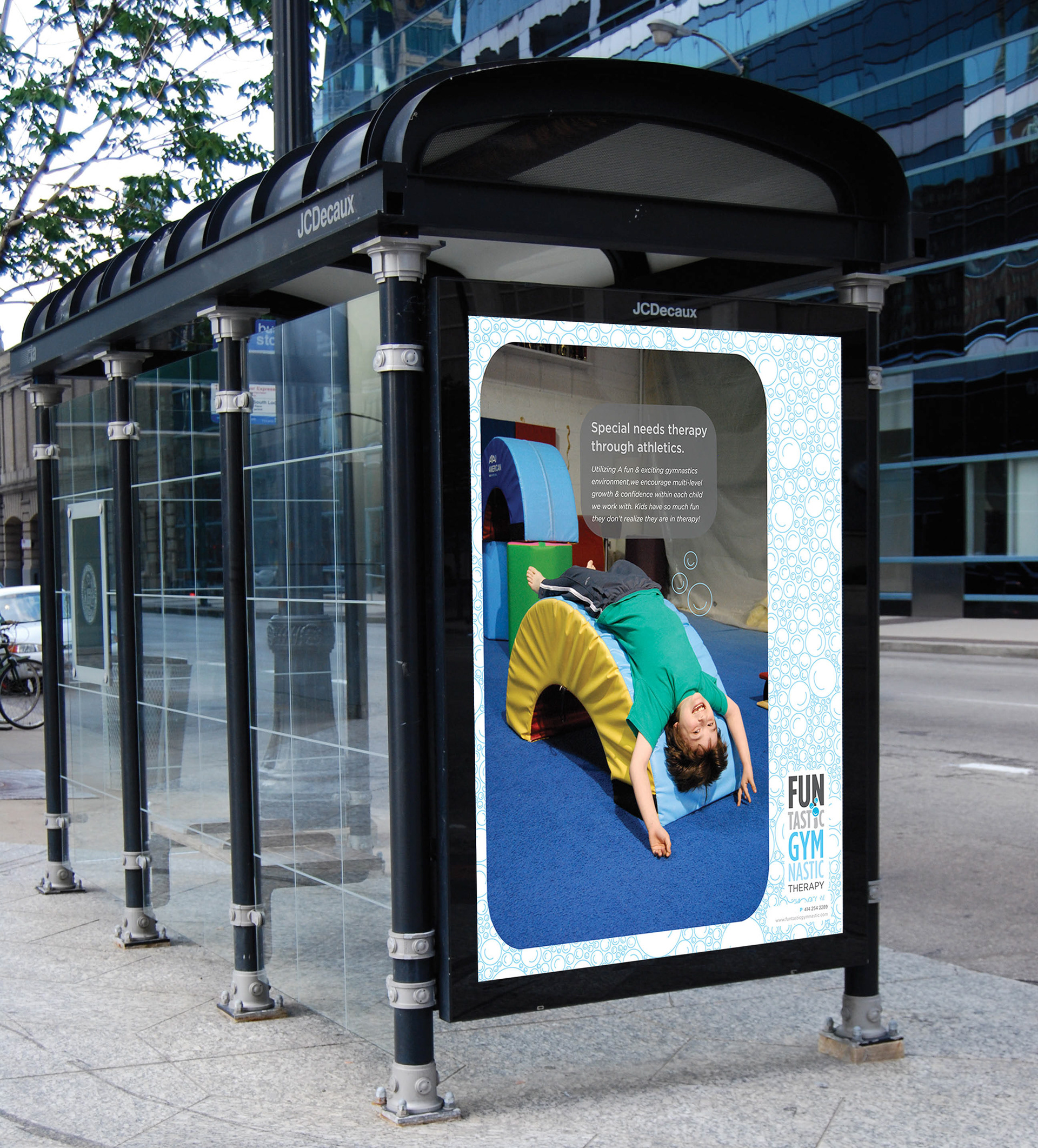
Below: photograph of one of the Funtastic Gymnastic ads on a bus stop billboard
Collateral Strategy: the typeface used in this identity system is Gotham. Specifically - bold condensed, Medium Condensed, and Book. The Gotham family of fonts is used for all company collateral due to the wide variety of weights that it contains. The tagline of this company, “fun-nominal therapy through gymnastics and sports,” helps to emphasize the mission of the company; which is to combine fun athletics with therapy to create an experience unlike traditional clinic based alternatives. The name of the company is broken up and stacked in the signature so that the first read is Fun followed by Gym and Therapy. The second halves, tastic and nastic are secondary so that the program’s mission is prevalent right away. The stacking of this name allows the company to escape from being pigeonholed as a gymnastics only program. This is important because they also offer programs such as competitive cheer leading.